
Too much choice used to feel like a luxury. Now, it feels like a burden.
Many destinations are overflowing with options: more shops, more screens, more pop-ups, more notifications. The intent is to give guests freedom. But when everything is promoted, nothing stands out. Instead of helping people discover something meaningful, it creates mental clutter.
And when guests feel overwhelmed, they don't choose. They leave. And when they leave without a positive story, they rarely return.
Human behaviour doesn't work the way many destinations assume. An avalanche of options doesn't create freedom. It creates fatigue. People skim past the highlights. They ignore the prompts. Or they check out entirely.
One well-known study proves the point. Researchers at Columbia University found that shoppers faced with 24 jam flavours were 90% less likely to buy than those offered just six. More choice didn't lead to better decisions. It led people to walk away.

The impact of choice overload
When guests feel overwhelmed, three things happen:
- They disengage – bypassing experiences that might have delighted them.
- They spend less – unable to filter and focus, they delay or avoid purchases.
- They leave exhausted – not inspired, but drained.
And research backs this up. Decision fatigue reduces consumer willingness to pay and lowers satisfaction with the choices they do make (Vohs et al., 2008). That means destinations not only risk losing immediate revenue, but also long-term loyalty.
The Westfield London food court offers a case in point. Faced with menus spanning dozens of cuisines, many guests felt overwhelmed. To solve this, it simplified its food court menus, using digital boards that rotate options, presenting fewer choices at once. This resulted in increased dwell time and higher average spend. By editing, not adding, the destination improved both experience and outcomes.
Why destinations create overload
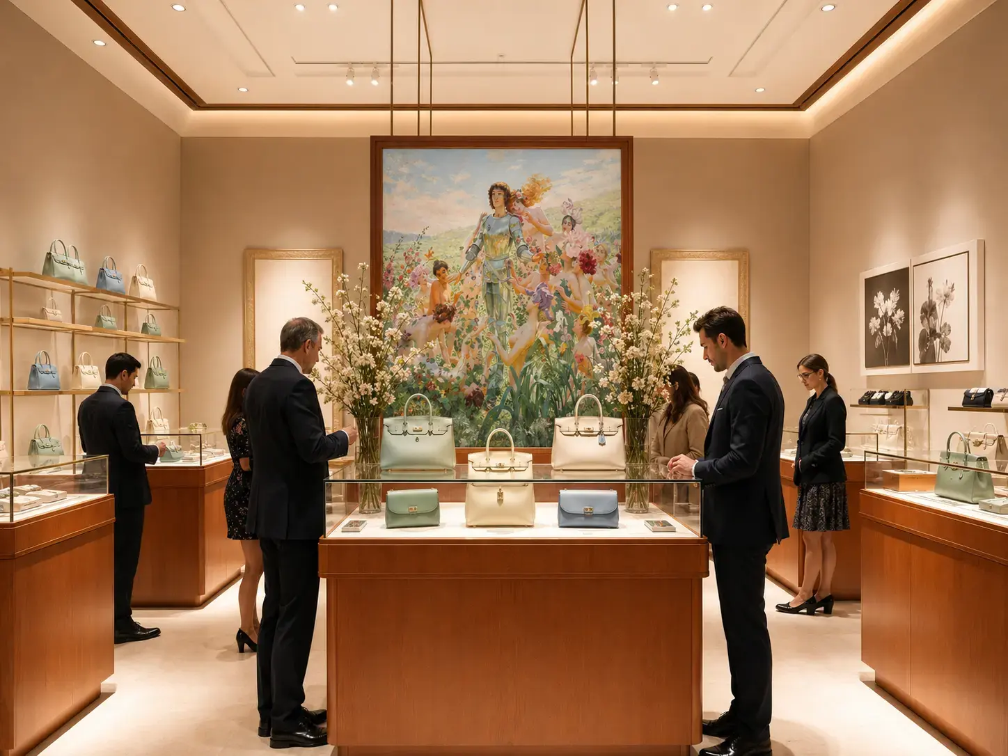
Many destinations confuse abundance with value. More tenants in the mall. More rooms in the resort. More features in the app.
Technology has supercharged this tendency. Every brand wants to push a notification. Every outlet wants digital visibility. Every operator wants more touchpoints. But without orchestration, digital and physical collide, resulting in overload. And you’re left with a flat and underwhelming journey, stories without focus and guests without guidance.
Hospitality offers a lesson here. Marriott once ran multiple loyalty and booking apps across its portfolio, each with slightly different rules, functions and branding. This caused confusion for guests. But by unifying them into a single platform, Marriott reduced digital clutter and gave guests a clearer, more consistent and calmer way to engage.
Designing to reduce overload
Reducing overwhelm isn’t about cutting choice, it’s about designing clarity. That requires thinking about how people process information, not just what they consume.
- Experience pacing – every journey needs peaks, pauses and transitions. Without contrast, destinations blur into noise. The best places design for rhythm, alternating moments of energy with spaces to breathe.
- Cognitive load – each choice, sign or notification adds to the mental effort required. The more effort exerted, the less joy is experienced. Destinations that reduce cognitive load create experiences that feel effortless.
- Personalisation – done well, personalisation isn’t about showing guests more options. It’s about filtering for relevance. It’s the difference between ‘Here’s everything’ and ‘Here’s what’s right for you.’
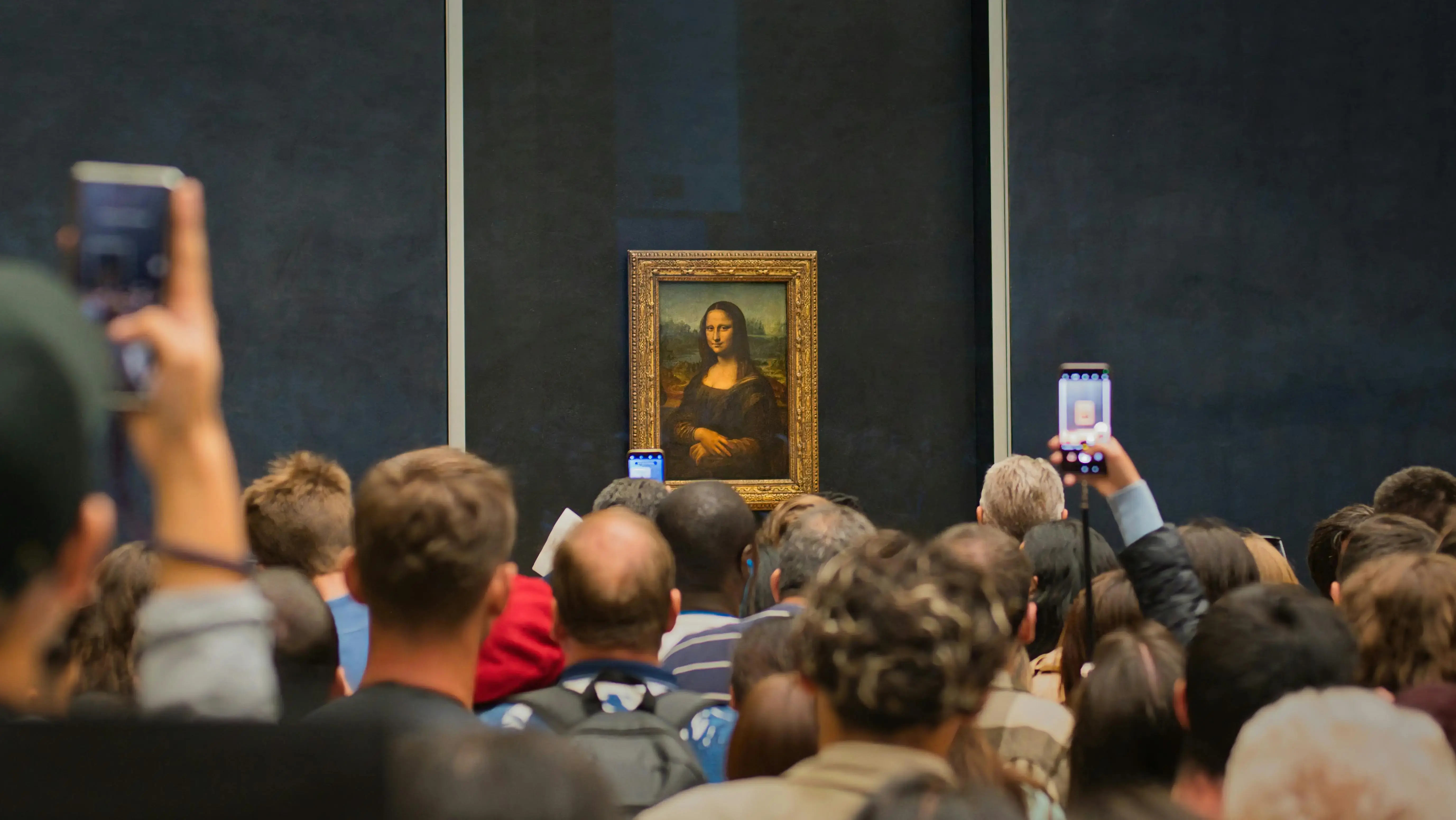
Consider the Louvre. In 2023, the museum introduced a daily cap of 30,000 visitors to reduce congestion (The Art Newspaper). On paper, fewer people might mean fewer ticket sales. But in practice, it created more space to breathe through experience pacing. Guests could navigate with less stress, focus on the art, and leave with a more memorable experience.

Curating with courage
The destinations that thrive are those willing to edit. Curation requires courage: the willingness to remove in order to reveal. Because overwhelmed guests don’t choose, they leave.
Think of a well-designed exhibition. It doesn’t show every artefact in storage. It selects, frames and sequences so the story makes sense and the highlights resonate. Destinations should take the same approach.
Curation isn’t about offering less, it’s about offering better. A clear story beats a cluttered shelf. Guests who can find their way, discover something memorable, and feel guided will spend more, share more and return more often.
Changi Airport’s Jewel complex shows what curation looks like at scale. Instead of stacking endless retail, it orchestrates experiences. The Rain Vortex provides spectacle. Indoor gardens create calm. Shopping and dining are woven into the flow rather than layered on top. The result isn’t overload; it’s harmony
From noise to navigation
The real challenge isn’t lack of choice, it’s lack of orchestration. Guests want to feel guided, not abandoned. They want confidence that they’re seeing the best of what’s on offer, not endlessly skimming menus or ignoring push notifications.
Here are four shifts you can make:
Blend, don't stack
Use digital as a concierge, not as a loudspeaker. A well-designed app can reduce noise by streamlining discovery, not adding layers.
Curate with courage
Edit down to what matters most. Fewer, better options stick in the memory and drive higher spend.
Shape flow with intent
Design like a journey, with natural peaks, pauses and transitions. Guests should feel carried through, not forced to fight through.
Measure what lingers
Success isn’t only what people bought. It’s what they remember, retell and recommend a day, a week, or a year later.
The destinations that understand this shift will stand apart. They won’t just attract guests. They’ll create clarity, focus and memories that last.
Creating clear choices
Overwhelmed guests don’t choose, they leave. The places that win aren’t the ones with the most options, but the ones that design clarity.
By blending digital and physical touchpoints into a coherent whole, curating with courage, and shaping journeys with intent, destinations can turn fatigue into flow.
Because freedom doesn’t come from more choice. It comes from choices that feel clear, meaningful and memorable.
At Engine, we help destinations move from clutter to curation – building journeys that feel effortless, distinctive and memorable. If you’d like to explore how to design beyond abundance, let’s start the conversation.
Download your copy of our Destination Thinking: A guide to designing and delivering world-class destination experiences.